Thursday, September 25, 2014

Lunch with Christopher Hogwood


Today's post honors a legendary artist — I was fortunate to hear Chris Hogwood perform many times, both as a harpsichordist and a conductor, and own many of his recordings. My logo design for his orchestra (shown above) was a student project from the early 1990s. Chris was gracious enough to sign it and even asked for a print for his office in Cambridge, England. 

The Academy of Ancient Music (AAM) is one of the finest period-instrument orchestras in the world, and founder Christopher Hogwood (1941 - 2014), was a well-known conductor, scholar and harpsichordist. I was saddened to learn of his passing yesterday at age 73.

Although I'm not a musician — just an avid listener — I was fortunate to meet Chris after a performance with the St. Paul Chamber Orchestra in 1994. We had lunch at the St. Paul Grill and talked about art and music for two hours. Unfortunately, I don't have a photo — that was way before cell phones AND selfies! But I remember his graciousness, droll English wit, and his wide interest in the arts, both visual and performing.

When he found out I was a graphic designer, Chris mentioned his mother's collaboration with type designer/author Eric Gill on "An Essay on Typography." The original, calligraphic "AAM" logo was designed by Cambridge friend Will Carter of Rampant Lions Press in 1973.

Art Deco-Era Type
Although the Academy of Ancient Music is part of the "early music" or historically informed performance practice movement, I chose the American Art Deco-era typeface Huxley Vertical for my logo project because it echoed the archways in the classic black and white engraving so perfectly.

Huxley was designed in 1935 by Walter Huxley and is available in digital form from Linotype. It remains one of my favorite display faces. http://www.linotype.com/150440/huxleyvertical-family.html

Type Is Art
In our firm, fine typography is as important as great imagery and quality text. We select typefaces carefully from our vast library because type sets a distinct mood, and our goal is to make the perfect choice for every project.

Design services
We help clients in a range of professions advertise their businesses and organizations. Contact Emilie at studio@emiliepallosdesign.com to set up a complimentary meeting.

Good design is good business.
______

Further reading and listening…

Performances and lectures by Christopher Hogwood at Gresham College, London

1. Engaging 1 hour performance (April, 2013). Musical introductions and performance by students in the Royal Academy of Music. "Music under the shadow of Handel" — works by Boyce, Arne and Geminiani.

2. And for something slightly newer (and Viennese!) — A great performance of Schubert's Fantasy in F minor, D. 940 (Nov. 2012):


If videos aren't visible, please click these YouTube links to view performances described above:
https://www.youtube.com/watch?v=aWm9eGhZLBk
https://www.youtube.com/watch?v=-Hd9JjcF5Ig


Other comprehensive info on Hogwood, Eric Gill and the Carters:

• Christopher Hogwood
• Designer / Typographer Eric Gill

• Designers Will Carter and Sebastian Carter


Christopher's address in his own handwriting. How artistic!

A charming little book about lettering.

My grandmother was named Esther, so this is a particular favorite.
The AAM Handel oratorios are sublime.

From my collection.

C O D A
We came across upon this amusing letter which ran in The Spectator in October, 2014:
Dining with Vivaldi
Sir: The late Christopher Hogwood (Music, 4 October) was not only an early musician but also an early activist against piped music. Dining one day at Midsummer House, Cambridge, Hogwood asked if the inevitable Vivaldi might at least be turned down. As the waiter went off to attend to the request, a fellow diner at the next table leant over and murmured sympathetically, ‘We’re not musical either.’
Richard Abram
Wanstead Park, Essex

Monday, September 22, 2014

Personal stories add warmth to new Ascencia Report

Ascencia client Blanca Zavala and two of her children, J'Len and Kevin.
Photo by Vic Pallos

A S C E N C I A
is a homeless services agency in the greater Glendale, California area. For our readers outside Los Angeles, Glendale is a suburb of 200,000 residents located 15 minutes north of downtown.

Ascencia's Executive Director Natalie Profant Komuro asked our firm to design the new two-year Community Report. She wanted a clean, stylish, modern feel, similar to our work for other clients. The book will be integral in attracting donors and for spreading the word about Ascencia's vital services. 

Our creative team spent many hours at Ascencia for photo shoots, story research and interviews. We became acquainted with dozens of wonderful people — staff, volunteer guest chefs, and current and former residents. 

Everyone has a story
In addition to creative direction and design, our firm also provided copywriting, editing and photography services for this project.

We interviewed two former Ascencia shelter residents for stories which appear in the book — Lanny Allen, an Air Force veteran who lost his home during the economic downturn, and Blanca Zavala, mom of three, who endured years of domestic violence.

Both Lanny and Blanca now have comfortable, stable home situations, provided with the help of Ascencia. The report also features stories about initiatives and services for families, children, seniors and veterans, as well as Board and donor pages, guest chef and volunteer stories, and financial statements.

It was our privilege to design this important project for Ascencia.

___

"Emilie, thank you so much for your help throughout the entire process….you were gracious and patient through it all. I know Natalie is super grateful for you and Vic so please let me add my sincere gratitude to hers."

Sarah Joung
Development Director
Ascencia
___

For a copy of Ascencia's 2011-13 Community Report, please contact Emilie at studio@emiliepallosdesign.com. We help companies and organizations with successful design, marketing and advertising campaigns, in print and online. Ask Emilie for a free project consultation.

Ascencia's Report cover and several page spreads are shown below. Take a look!

Good design is good business.


Wednesday, September 17, 2014

What's the takeaway? A good brochure


At presentations or events, we always appreciate a smartly designed, well-written printed program or brochure which contains reliable information about the subject. This is especially important in investment seminars — if trust isn't established, investors will go elsewhere.

The California-Pacific United Methodist Foundation has 75 years' experience advising churches and parishioners in investments and planned giving, but lacked a targeted brochure about its services and stewardship opportunities.

Enhancing the Marketing Mix
This new brochure folds to 4 x 9 inches, and fits easily in a #10 envelope, pocket or briefcase. And it's cost-effective to produce — less than $1.50 per piece for design and offset printing.

The brochure's color scheme, typography and content also coordinate with our website design for the Foundation: www.cpumf.org. The botanical theme is eye-catching and fresh, in print and online. 

Foundation CEO Greg Batson makes dozens of investment presentations to church groups throughout the year. Many of the Foundation's investors are seniors. Rev. Batson now has a high-quality printed piece to support his presentations and for churches to display in literature racks.

"The brochures have arrived and they look great. Thank you for your fine design work."

Rev. Greg Batson, CEO
California-Pacific United Methodist Foundation

Contact Emilie today for help with marketing and advertising, in print and online: studio@emiliepallosdesign.com.

Good design is good business.


Friday, September 12, 2014

Love-Love: New Identity


T E N N I S ,  A N Y O N E  ?

After creating a successful marketing package / spiral-bound book for our friend Ron Zambrano at Fremont Tennis Center, we are now rebranding the center. 

A classic sans serif
Because typography is so important in identity, we take great care in selecting exactly the right type family for each project. Emilie chose Frutiger — modern, readable in large and small sizes, and available in a range of weights. 

Frutiger was designed for the wayfinding program in the Charles De Gaulle Airport in 1968 by Swiss designer Adrian Frutiger. It was issued for small-scale (print) use in 1977, and has been a favorite of designers worldwide for publications and corporate communications. Frutiger has beauty and grace, just like a good tennis match.

History
Engaging article about "Neue Frutiger," the updated version of Frutiger:

The story of Frutiger and type samples: http://www.linotype.com/2534/frutiger.html

Related design projects
Additional projects for Fremont Tennis Center are in the works — new website, social media artwork, advertising banners and printed marketing materials. All will feature the new corporate identity and recognizable look. 

Why Emilie Pallos Graphic Design? 
• Timeless, professional work for clients in a range of industries
• Beautiful, effective website design
• Award-winning print design (corporate communications, identity, annual reports)

Contact Emilie today for a complimentary consultation: studio@emiliepallosdesign.com

Good design is good business

Business card


Millie, Fremont Tennis Center's mascot
(She will be making an appearance in the marketing campaign!)

Wednesday, September 10, 2014

Deborah's Design Legacy

Deborah Sussman at her WUHO Gallery show, late 2013. Photo by Laure Joliet.

D  E  B  O  R  A  H     S  U  S  S  M  A  N    

(  1  9  3  1   –    2  0  1  4  )

I was saddened to hear of the Aug. 19, 2014, passing of legendary environmental graphic designer Deborah Sussman, an AIGA-medal winning "rock star" of our profession.

During a studio tour of Sussman/Prejza and Co. in the early 1990s, I glimpsed the great designer in action. She was making a presentation to a large group of clients, and I've always remembered that larger-than-life presence (despite her petite size!).

While on jury duty in downtown L.A. this summer, I spent my lunch break in Grand Park adjacent to the courthouse. The vast public space was one of the last creative projects she worked on. Cool plants and colorful wayfinding (oversized plant "markers" in bright colors) and bright magenta outdoor furniture really pop. Frank Gehry's Walt Disney Concert Hall is a 10-minute walk away.

………………....

In the 1960s she collaborated with Gehry on the interior design of a high-end Joseph Magnin department store in San Jose. "We invented a model for retail, we thought," Gehry said. It involved filmed runway shows projected on a wall and graphics that could be changed as new products came into the store. "We would stay up late, talking and agonizing about where things should go. She was an artist, and it was a hell of a collaboration. I'll never forget it."

From the L.A. Times obituary published 8/21/14. Full story here: Los Angeles Times

………………....

Read another tribute with fantastic photos here: Curbed LA

In early 2014, Deborah's retrospective at the WUHO Gallery in Hollywood was amazing and beautifully presented. Here's my blog entry: A Bird's Eye View of the Design World

:)

LACMA has now re-issued the colorful 1966 "Sussman" paper bags.

Grand Park in downtown L.A. (June, 2014). Photo by Emilie Pallos


Wednesday, September 3, 2014

Going for the Win with a Smashing Presentation

Custom-designed finished presentation books


Fast-track project
Our friend, tennis pro Ron Zambrano, asked us on Aug. 19, 2014, to help with a creative project on a tight deadline. The proposal (eight copies of 58-page bound books) was due Aug. 29, 2014. The book needed to be written and designed, feature pages in black and white and in color, and conform to the rigorous City of Glendale Request for Proposal format. 

A new five-year City contract was going out to bid and Ron wanted to make the best presentation possible to retain management of the Center. Other prominent tennis management firms and pros were also bidding on the contract. 

Our experienced creative team of art director/designer and copywriter/editor/photographer began work right away. It took many hours to compile the "ingredients" — letters of recommendation, references, background information, qualifications, financial materials and analysis, and 15+ pages of exhibits/visuals. A new marketing and advertising plan needed to be planned and written for two locations covering 12 courts. And the design needed to be "smashing!"

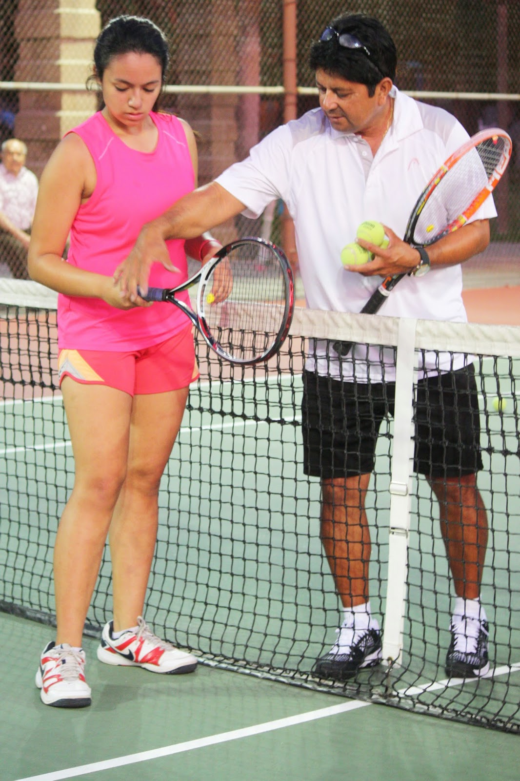
Ron has been head tennis professional and manager at Fremont for the past 14 years. We've created flyers and posters for special events and Emilie plays tennis there every week, so we know the game and subject really well!

Professional Design & Presentation
After the pages were designed, edited, proofread, and then proofread and edited again, we were ready to go to print. We partnered with Monique Poon and her team at Minuteman Press in Glendale to produce the spiral-bound books. Minuteman did an amazing job completing work in record time to meet our deadline. Thank you, Monique!   http://www.minuteman-glendale.com

Our Expertise
EPGD has designed successful projects for clients for more than 16 years — for those in the arts, healthcare, and businesses large and small. Contact Emilie at studio@emiliepallosdesign.com to talk about your creative project, rush or not-so-rush.

Good design is good business.

Cover and interior page spread
Books in production
USPTA professional Ron Zambrano
instructing a student at Fremont Tennis Center
Photo by Vic Pallos
Tennis under the lights — Photo by Vic Pallos

Saturday, August 30, 2014

Great music — with 18,000 of your closest friends


M U S I C   I  S   A R T


Those who visit our studio are often greeted with the sounds of Beethoven or Handel, Sibelius or Mahler on the stereo. So it was fantastic to meet L.A. Philharmonic trumpet player Chris Still at a Patron party last week at the Hollywood Bowl.

I really enjoy listening to our "local band" year-round. You can't beat a picnic at the Bowl during the summer, and the fantastic acoustics of Walt Disney Concert Hall during the winter season.

Our design work for clients often features classical typography, stunning photos and subtle, beautiful color. That's our forte. But we do have a wilder streak — going bolder and more contemporary when the time is right.

Send a note to Emilie to talk about your project: studio@emiliepallosdesign.com

Identity, corporate communications & advertising, in print and online

Good design is good business.

____

The New Yorker Visits the Left Coast
Read music critic Alex Ross's article on the Bowl's current season (published Aug. 25, 2014):

http://www.newyorker.com/magazine/2014/08/25/stars-4


Thursday, May 22, 2014

Sylvester & Tweetie?… Say hi to Roger & Peep!

"Roger & Peep"
20" x 16" Oil on canvas  © 2014 Sandy McDaniel
Roger plays with his favorite pom-pom toys as Peep looks on!


Our friend and colleague Sandy McDaniel is a talented artist — painter, sculptor, illustrator and environmental graphic designer. She has exhibited her paintings of equestrian subjects and landscapes in a solo exhibition at the Southwest Museum in L.A., and her work has been featured in Montana and Wyoming galleries. 

Love of Animals
As a longtime equestrian, Sandy captures the authentic spirit of the west, riding, and horses in her paintings. She also has a love of all animals. When our cat Roger was a kitten, Sandy made house calls and offered training tips. Sandy is definitely a "Cat Whisperer."

As some of you know, we have a "designer bird" in our studio — Peep. Although Peep and Roger have never met (for obvious reasons!), we thought it would be really cool to have an original painting of them together. So we commissioned Sandy to paint an "official" portrait.

The painting depicts Roger in his favorite "kitty yoga" pose while Peep remains safely out of reach. It's a charming painting. Thank you, Sandy!

…………….. 

Our creative services
Add value to your company with new online visuals (websites, social media integration), identity and collateral (brochures, annual reports & fine stationery design). Send a note to Emilie at studio@emiliepallosdesign.com.

Good design is good business.

_____ 

Enjoy Sandy McDaniel's fine art in this mini-gallery

More great paintings are here: http://www.smcdanielassociates.com


"Not A Cloud"
66" x 18" Oil on canvas  © 2009 Sandy McDaniel


"Neighbors"
24" x 12" Oil on canvas  © 2009 Sandy McDaniel


"The Mustang"
40" x 48" Oil on canvas  © 2009 Sandy McDaniel
"Three"
66" x 24" Oil on canvas  © 2009 Sandy McDaniel

Monday, May 5, 2014

Brand Library & Art Center: A Restored Gem in the Jewel City

1969 addition (left) connects Moorish-influenced main house


Behind the majestic Miradero gate sits a grand house — Brand Library & Art Center, Glendale's jewel for art and music.

Art Research
In college, I spent countless hours at Brand poring through art and design books for research papers. The library contains a stellar collection of fine art, design, typography, architecture and music books and a fantastic CD and video collection. My interest in visual and performing arts was nurtured at Brand, and in the 1990s I served on the Board of Directors and designed the library's quarterly publication.

The Moorish-influenced house is more like a movie set than a library, and unlike anything in Glendale. Or anywhere!

The name "Brand" is an important name in town. Leslie Coombs Brand was the "father of Glendale," a land developer and successful businessman. He passed away in 1925, and deeded his 5,000 square foot house and grounds to the City of Glendale for a library and park. The library opened in 1956, 10 years after Mrs. Brand's passing.

R E S T O R A T I O N
I recently heard a terrific lecture and tour given by Debra Gerod, FAIA, LEED AP, who directed the Brand Library restoration team. She presented an inside look at the two-year restoration and shared the challenges and triumphs of the multi-faceted project. Thank you, Debra! She is a Partner in the architectural firm Gruen Associates: http://www.gruenassociates.com.

Those who haven't been to Brand Library lately will marvel at the interior colors and the details. I hardly recognized the rooms, now restored to the original 1904 look (as much as possible). I never realized that my favorite room was originally the Solarium, right in the middle of the house. In the 1980s and '90s, the room was filled with art books and didn't have much natural light. Today, the Solarium mimics the feeling of being outside. Fantastic!

Plenty of space is available for reading and doing research. Books line the walls in various rooms, and many items (110,000 books, scores, DVDs, CDs, LPs and magazines) are located in taller shelves towards the back. Brand is now accessible to the disabled, too.

A larger central courtyard and new interior lobby connects the original 1904 house and 1969 addition seamlessly. The 1969 building contains the galleries and recital hall and features a terrific skylit space. Free concerts, art and music lectures, films, exhibitions and more are offered all year: http://www.brandlibrary.org. Don't miss this jewel, right here in the Jewel City.

____

Design is our passion
Contact Emilie for help in getting the word out about your company or organization, online and in print: websites / corporate communications / corporate identity.
E-mail studio@emiliepallosdesign.com. Visit us online: http://www.emiliepallosdesign.com.

Good design is good business.

Restored library interior — the blue wall color is dramatic and beautiful.

Mrs. Brand's sitting room. This stunning space reminds me of one of the ladies'
salons in Bullock's Wilshire, the late, great Los Angeles department store.  

The Solarium — now the center of the renovated library.

Ceiling stencils were applied by a team of five skilled artists during the restoration.
Mr. Brand surveys his domain — this famous portrait is now on view in the house.
Mr. Brand's monogram is seen in this recently discovered pedestal hidden in an alcove for many years.

Architect Debra Gerod, FAIA, LEED AP,
Partner in Gruen Associates, led our tour.
The Brand Library CD collection is astounding — from grand opera to the latest stars.
Designers will note the Saul Bass book to the right. 
Need a music score? Brand probably has it.
Moorish-influenced architectural shapes grace sunscreen in 1969 building.
Sculptural Moorish archways: west façade of 1904 library.

Tuesday, February 25, 2014

Let's get moving! Movement Links website launched

NEW Home Page:
Lighter background, strong photos, good copy

Movement Links, a presenter of neuromuscular physical therapy rehabilitation seminars, hired Emilie Pallos Graphic Design to update its online presence. Owner Clare Frank likes our firm's "clean, modern visual style," and was referred to us by client Karen Joubert (owner of Joubert Physical Therapy).

Custom-designed website
The new website is targeted to a well-educated, sports-oriented demographic — physical therapists. Testimonials by well-known trainers and PTs from professional sports teams appear throughout. Site was programmed by our web developer who understands a designer's strict attention to detail. Text is easily updated as seminars are added during the year.

Viewers will find pages easy to navigate in both desktop and mobile versions. Video and audio content is included, and readers can register for upcoming seminars through the new site.

As a full-service creative firm, we also took new staff portraits and edited copy.

Social media integration
To coordinate with the launch of new site, Emilie created a blog (for postings by staff members), and Facebook banner artwork. Since Movement Links presents seminars worldwide, its Facebook page attracts new followers daily — that page was viewed by 1,229 readers last week!

A few comments about our design:

"Excellent website, easy to negotiate and provides clear guidance to your courses and positive comments from participants. Well done!"    — Inger Villadsen

"Your redesigned site looks so great, Clare. Layout and content are nicely organized, too!"   —Erin McGuire

 "It (site) is very good, welcoming and grabs your attention!!"    —Lin Choo

View Movement Links site here: http://www.movementlinks.com

We love referrals
Please continue to let your friends and colleagues know about our work. We appreciate your referrals. Emilie can be reached at studio@emiliepallosdesign.com. Thanks!


NEW Resources page which features video and audio files.


"OLD" Home Page
Copy can be difficult to read on a dark background.

Wednesday, February 19, 2014

Sussman's Supergraphics: Witty & Fun


Last month I visited Woodbury University's gallery on Hollywood Blvd. (WUHO) to see an exhibition featuring the graphic design work of legendary Los Angeles-based designer Deborah Sussman.

As a young teenager, I attended many events during L.A.'s Summer Olympics in 1984, and have long remembered the "supergraphics" and colors used in and around the venues. Orange, bright green, turquoise and magenta were chosen by Sussman and her design team to reflect the world's athletes.

One of my favorite large-scale design elements at the Olympic venues were "Sonotubes," stylish cylindrical artwork which flanked venue entrances — modern-day Greek columns. They look a bit like giant paper towel rolls wrapped in bright hues, patterns and type. A group of Sonotubes was assembled in WUHO's space. It was great to see them again after 30 years!

This show also featured the artist's early work — including brochures and packaging Deborah created while working in the Office of Charles and Ray Eames (where she began her career in 1953). In the 1950s, Ray Eames and Deborah were among the few women designers in our profession.

In the last few years, Deborah's artwork has been featured in several exhibitions. And she's still doing impactful design — Sussman/Prejza & Co. designed downtown L.A.'s Grand Avenue Park wayfinding and graphics (2012). You can't miss the "signature" magenta park benches.

Thanks, Debbie, for inspiring generations of designers — including me!

Interviews
Deborah talks about her career in these video clips:


About Our Firm
Emilie Pallos Graphic Design
website & print design / identity / marketing communications / advertising

Contact Emilie today to talk about your creative project: studio@emiliepallosdesign.com or call (818) 242-9055. Visit us online at www.emiliepallosdesign.com.

Good design is good business.

Bright colors defined the '84 Olympics.
Poster showing "kit of parts" (graphic standards) for '84 Olympics.
Get out your sunglasses! :)
Gallery murals show Olympic architectural structures.
Visitors enjoy the artwork.
Vintage brochure for Eames chairs. I have a bright blue "PKC-1" from 1968.

Bags for L.A. County Museum of Art's gift shop (1960s)
Sonotubes flank the rear of the gallery.
More Sonotubes in the spotlight. Cheers!