Wednesday, September 3, 2014

Going for the Win with a Smashing Presentation

Custom-designed finished presentation books


Fast-track project
Our friend, tennis pro Ron Zambrano, asked us on Aug. 19, 2014, to help with a creative project on a tight deadline. The proposal (eight copies of 58-page bound books) was due Aug. 29, 2014. The book needed to be written and designed, feature pages in black and white and in color, and conform to the rigorous City of Glendale Request for Proposal format. 

A new five-year City contract was going out to bid and Ron wanted to make the best presentation possible to retain management of the Center. Other prominent tennis management firms and pros were also bidding on the contract. 

Our experienced creative team of art director/designer and copywriter/editor/photographer began work right away. It took many hours to compile the "ingredients" — letters of recommendation, references, background information, qualifications, financial materials and analysis, and 15+ pages of exhibits/visuals. A new marketing and advertising plan needed to be planned and written for two locations covering 12 courts. And the design needed to be "smashing!"

Ron has been head tennis professional and manager at Fremont for the past 14 years. We've created flyers and posters for special events and Emilie plays tennis there every week, so we know the game and subject really well!

Professional Design & Presentation
After the pages were designed, edited, proofread, and then proofread and edited again, we were ready to go to print. We partnered with Monique Poon and her team at Minuteman Press in Glendale to produce the spiral-bound books. Minuteman did an amazing job completing work in record time to meet our deadline. Thank you, Monique!   http://www.minuteman-glendale.com

Our Expertise
EPGD has designed successful projects for clients for more than 16 years — for those in the arts, healthcare, and businesses large and small. Contact Emilie at studio@emiliepallosdesign.com to talk about your creative project, rush or not-so-rush.

Good design is good business.

Cover and interior page spread
Books in production
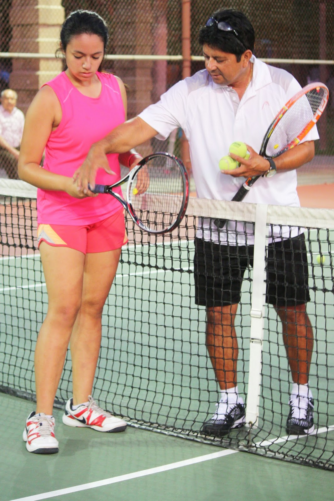
USPTA professional Ron Zambrano
instructing a student at Fremont Tennis Center
Photo by Vic Pallos
Tennis under the lights — Photo by Vic Pallos

Saturday, August 30, 2014

Great music — with 18,000 of your closest friends


M U S I C   I  S   A R T


Those who visit our studio are often greeted with the sounds of Beethoven or Handel, Sibelius or Mahler on the stereo. So it was fantastic to meet L.A. Philharmonic trumpet player Chris Still at a Patron party last week at the Hollywood Bowl.

I really enjoy listening to our "local band" year-round. You can't beat a picnic at the Bowl during the summer, and the fantastic acoustics of Walt Disney Concert Hall during the winter season.

Our design work for clients often features classical typography, stunning photos and subtle, beautiful color. That's our forte. But we do have a wilder streak — going bolder and more contemporary when the time is right.

Send a note to Emilie to talk about your project: studio@emiliepallosdesign.com

Identity, corporate communications & advertising, in print and online

Good design is good business.

____

The New Yorker Visits the Left Coast
Read music critic Alex Ross's article on the Bowl's current season (published Aug. 25, 2014):

http://www.newyorker.com/magazine/2014/08/25/stars-4


Thursday, May 22, 2014

Sylvester & Tweetie?… Say hi to Roger & Peep!

"Roger & Peep"
20" x 16" Oil on canvas  © 2014 Sandy McDaniel
Roger plays with his favorite pom-pom toys as Peep looks on!


Our friend and colleague Sandy McDaniel is a talented artist — painter, sculptor, illustrator and environmental graphic designer. She has exhibited her paintings of equestrian subjects and landscapes in a solo exhibition at the Southwest Museum in L.A., and her work has been featured in Montana and Wyoming galleries. 

Love of Animals
As a longtime equestrian, Sandy captures the authentic spirit of the west, riding, and horses in her paintings. She also has a love of all animals. When our cat Roger was a kitten, Sandy made house calls and offered training tips. Sandy is definitely a "Cat Whisperer."

As some of you know, we have a "designer bird" in our studio — Peep. Although Peep and Roger have never met (for obvious reasons!), we thought it would be really cool to have an original painting of them together. So we commissioned Sandy to paint an "official" portrait.

The painting depicts Roger in his favorite "kitty yoga" pose while Peep remains safely out of reach. It's a charming painting. Thank you, Sandy!

…………….. 

Our creative services
Add value to your company with new online visuals (websites, social media integration), identity and collateral (brochures, annual reports & fine stationery design). Send a note to Emilie at studio@emiliepallosdesign.com.

Good design is good business.

_____ 

Enjoy Sandy McDaniel's fine art in this mini-gallery

More great paintings are here: http://www.smcdanielassociates.com


"Not A Cloud"
66" x 18" Oil on canvas  © 2009 Sandy McDaniel


"Neighbors"
24" x 12" Oil on canvas  © 2009 Sandy McDaniel


"The Mustang"
40" x 48" Oil on canvas  © 2009 Sandy McDaniel
"Three"
66" x 24" Oil on canvas  © 2009 Sandy McDaniel

Monday, May 5, 2014

Brand Library & Art Center: A Restored Gem in the Jewel City

1969 addition (left) connects Moorish-influenced main house


Behind the majestic Miradero gate sits a grand house — Brand Library & Art Center, Glendale's jewel for art and music.

Art Research
In college, I spent countless hours at Brand poring through art and design books for research papers. The library contains a stellar collection of fine art, design, typography, architecture and music books and a fantastic CD and video collection. My interest in visual and performing arts was nurtured at Brand, and in the 1990s I served on the Board of Directors and designed the library's quarterly publication.

The Moorish-influenced house is more like a movie set than a library, and unlike anything in Glendale. Or anywhere!

The name "Brand" is an important name in town. Leslie Coombs Brand was the "father of Glendale," a land developer and successful businessman. He passed away in 1925, and deeded his 5,000 square foot house and grounds to the City of Glendale for a library and park. The library opened in 1956, 10 years after Mrs. Brand's passing.

R E S T O R A T I O N
I recently heard a terrific lecture and tour given by Debra Gerod, FAIA, LEED AP, who directed the Brand Library restoration team. She presented an inside look at the two-year restoration and shared the challenges and triumphs of the multi-faceted project. Thank you, Debra! She is a Partner in the architectural firm Gruen Associates: http://www.gruenassociates.com.

Those who haven't been to Brand Library lately will marvel at the interior colors and the details. I hardly recognized the rooms, now restored to the original 1904 look (as much as possible). I never realized that my favorite room was originally the Solarium, right in the middle of the house. In the 1980s and '90s, the room was filled with art books and didn't have much natural light. Today, the Solarium mimics the feeling of being outside. Fantastic!

Plenty of space is available for reading and doing research. Books line the walls in various rooms, and many items (110,000 books, scores, DVDs, CDs, LPs and magazines) are located in taller shelves towards the back. Brand is now accessible to the disabled, too.

A larger central courtyard and new interior lobby connects the original 1904 house and 1969 addition seamlessly. The 1969 building contains the galleries and recital hall and features a terrific skylit space. Free concerts, art and music lectures, films, exhibitions and more are offered all year: http://www.brandlibrary.org. Don't miss this jewel, right here in the Jewel City.

____

Design is our passion
Contact Emilie for help in getting the word out about your company or organization, online and in print: websites / corporate communications / corporate identity.
E-mail studio@emiliepallosdesign.com. Visit us online: http://www.emiliepallosdesign.com.

Good design is good business.

Restored library interior — the blue wall color is dramatic and beautiful.

Mrs. Brand's sitting room. This stunning space reminds me of one of the ladies'
salons in Bullock's Wilshire, the late, great Los Angeles department store.  

The Solarium — now the center of the renovated library.

Ceiling stencils were applied by a team of five skilled artists during the restoration.
Mr. Brand surveys his domain — this famous portrait is now on view in the house.
Mr. Brand's monogram is seen in this recently discovered pedestal hidden in an alcove for many years.

Architect Debra Gerod, FAIA, LEED AP,
Partner in Gruen Associates, led our tour.
The Brand Library CD collection is astounding — from grand opera to the latest stars.
Designers will note the Saul Bass book to the right. 
Need a music score? Brand probably has it.
Moorish-influenced architectural shapes grace sunscreen in 1969 building.
Sculptural Moorish archways: west façade of 1904 library.

Tuesday, February 25, 2014

Let's get moving! Movement Links website launched

NEW Home Page:
Lighter background, strong photos, good copy

Movement Links, a presenter of neuromuscular physical therapy rehabilitation seminars, hired Emilie Pallos Graphic Design to update its online presence. Owner Clare Frank likes our firm's "clean, modern visual style," and was referred to us by client Karen Joubert (owner of Joubert Physical Therapy).

Custom-designed website
The new website is targeted to a well-educated, sports-oriented demographic — physical therapists. Testimonials by well-known trainers and PTs from professional sports teams appear throughout. Site was programmed by our web developer who understands a designer's strict attention to detail. Text is easily updated as seminars are added during the year.

Viewers will find pages easy to navigate in both desktop and mobile versions. Video and audio content is included, and readers can register for upcoming seminars through the new site.

As a full-service creative firm, we also took new staff portraits and edited copy.

Social media integration
To coordinate with the launch of new site, Emilie created a blog (for postings by staff members), and Facebook banner artwork. Since Movement Links presents seminars worldwide, its Facebook page attracts new followers daily — that page was viewed by 1,229 readers last week!

A few comments about our design:

"Excellent website, easy to negotiate and provides clear guidance to your courses and positive comments from participants. Well done!"    — Inger Villadsen

"Your redesigned site looks so great, Clare. Layout and content are nicely organized, too!"   —Erin McGuire

 "It (site) is very good, welcoming and grabs your attention!!"    —Lin Choo

View Movement Links site here: http://www.movementlinks.com

We love referrals
Please continue to let your friends and colleagues know about our work. We appreciate your referrals. Emilie can be reached at studio@emiliepallosdesign.com. Thanks!


NEW Resources page which features video and audio files.


"OLD" Home Page
Copy can be difficult to read on a dark background.

Wednesday, February 19, 2014

Sussman's Supergraphics: Witty & Fun


Last month I visited Woodbury University's gallery on Hollywood Blvd. (WUHO) to see an exhibition featuring the graphic design work of legendary Los Angeles-based designer Deborah Sussman.

As a young teenager, I attended many events during L.A.'s Summer Olympics in 1984, and have long remembered the "supergraphics" and colors used in and around the venues. Orange, bright green, turquoise and magenta were chosen by Sussman and her design team to reflect the world's athletes.

One of my favorite large-scale design elements at the Olympic venues were "Sonotubes," stylish cylindrical artwork which flanked venue entrances — modern-day Greek columns. They look a bit like giant paper towel rolls wrapped in bright hues, patterns and type. A group of Sonotubes was assembled in WUHO's space. It was great to see them again after 30 years!

This show also featured the artist's early work — including brochures and packaging Deborah created while working in the Office of Charles and Ray Eames (where she began her career in 1953). In the 1950s, Ray Eames and Deborah were among the few women designers in our profession.

In the last few years, Deborah's artwork has been featured in several exhibitions. And she's still doing impactful design — Sussman/Prejza & Co. designed downtown L.A.'s Grand Avenue Park wayfinding and graphics (2012). You can't miss the "signature" magenta park benches.

Thanks, Debbie, for inspiring generations of designers — including me!

Interviews
Deborah talks about her career in these video clips:


About Our Firm
Emilie Pallos Graphic Design
website & print design / identity / marketing communications / advertising

Contact Emilie today to talk about your creative project: studio@emiliepallosdesign.com or call (818) 242-9055. Visit us online at www.emiliepallosdesign.com.

Good design is good business.

Bright colors defined the '84 Olympics.
Poster showing "kit of parts" (graphic standards) for '84 Olympics.
Get out your sunglasses! :)
Gallery murals show Olympic architectural structures.
Visitors enjoy the artwork.
Vintage brochure for Eames chairs. I have a bright blue "PKC-1" from 1968.

Bags for L.A. County Museum of Art's gift shop (1960s)
Sonotubes flank the rear of the gallery.
More Sonotubes in the spotlight. Cheers!


Thursday, February 13, 2014

Memphis Bound!

Standing tall!

Once in awhile a special opportunity comes around. Yesterday, I had a chance to join a VIP tour of Bob Hope Airport in Burbank, CA. Although we visited other cool spots in the terminal and on the field including Million Air (ritzy corporate jets), and the Glendale/Burbank police air patrol helicopter unit, the highlight for me was "backstage" at the FedEx hangar, located west of the main passenger terminal.

B A C K S T O R Y
When talking about logos and branding with our clients, I have long cited the FedEx identity as an example of one of the best ever created. Futura Bold typography, strong secondary color combination (orange and purple), and that cool "hidden" arrow — a classic. The FedEx logo was created by international design and branding firm Landor (yes, they do "land" some great projects...).

Here's Landor's case study on the FedEx branding: http://landor.com/#!/work/case-studies/fedex/

B O U T I Q U E   F I R M :  B I G   I D E A S 
If you count the number of humans at our L.A.-area studio, no, we're not as large as Landor, but our work is creative, original, and targeted. We think big. Give Emilie a call or send a message to studio@emiliepallosdesign.com to talk about your design and marketing projects, online and in print. Please visit our website at www.emiliepallosdesign.com.

Au Revoir!

Hangar 4 at Burbank Bob Hope Airport
Hangar interior
Loading area
Each aircraft is named after FedEx employees' children. Hello, Whitney!
This Airbus A-300 aircraft can be fully loaded in 45 minutes by the most efficient crew in the business.
Notice the perfectly placed white arrow in the logo? One of my favorites.
All aboard!
Dress accordingly… It might be chilly on board.
Flightdeck
Metal rollers on the floor make loading and unloading cargo so much easier (but difficult to walk on).
Ladies in high heels, beware!


Cargo configuration diagrams posted inside the aircraft.
Parking space clearly marked in a cool stencil. Notice the "FedEx orange" tether.
Au Revoir!


Tuesday, January 21, 2014

Fiddler on the Boulevard

HOLLYWOOD, CALIFORNIA

The stylish terrazzo and brass stars on Hollywood Blvd. are only a 15-minute drive from our Glendale studio. It's fun to pop down once in awhile to people-watch, especially on a sunshine-filled winter day.

There's also a smart little gallery run by Woodbury University right in the heart of Hollywood - more on the WUHO gallery in our next post.

In our office, we love great art and music. Violinist Isaac Stern was a master - one of the best players ever to pick up a bow. And Emilie's yellow-soled Sperry Top-Siders add a touch of modern cool to this photo!

Good design is good business.