
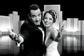
Emilie, typical of most art director/designers, loves all things different. So "The Artist" was a must-see, especially on the big screen. Just think, a silent film for 2012, beautifully realized by a French team and shot in L.A.... Amazing.
The detail in this film is exquisite, with late 1920s-era interior design, Spanish architecture, gorgeous costumes, and recognizable location photography around town.
The Bradbury Building is featured, and the concrete residential streets of Hollywood are largely unchanged today. And Variety still uses the same type / nameplate as it did in the 1920s.
Classic.
The French actors didn't have to worry about about dialogue, because this isn't a "talkie." Title cards kept the action moving.
We always tell our own clients "Don't change what works." For instance, if your company has a logo that is well-designed and timeless, keep it. Maybe all it needs is a fresh new color scheme. Or different typography. A good designer will make cost-effective recommendations within your budget. Of course, if you need or prefer a brand new look, we'd be happy to help.
"The Artist" has charm, style and substance. Uggie the terrier is priceless, and nearly steals the show. Too bad they don't award an Oscar for Best Dog!
What's that word again? Classic?
Good design is good business.
Emilie Pallos Design = Classic, for sure. This client fully agrees.
ReplyDelete